Tinnitus UK: Revitalising a lifeline charity
The Brief
Tinnitus UK (formerly known as the British Tinnitus Association) has been the leading charity for Tinnitus research since 1979. They’re the key support network for those living with the condition, drivers in facilitating and supporting research and an essential voice of authority in the prevention of tinnitus.
We had the privilege to refresh their brand identity, deliver a new name, tone of voice and visual identity that would reflect their expertise while propelling their reach to more people living with tinnitus.
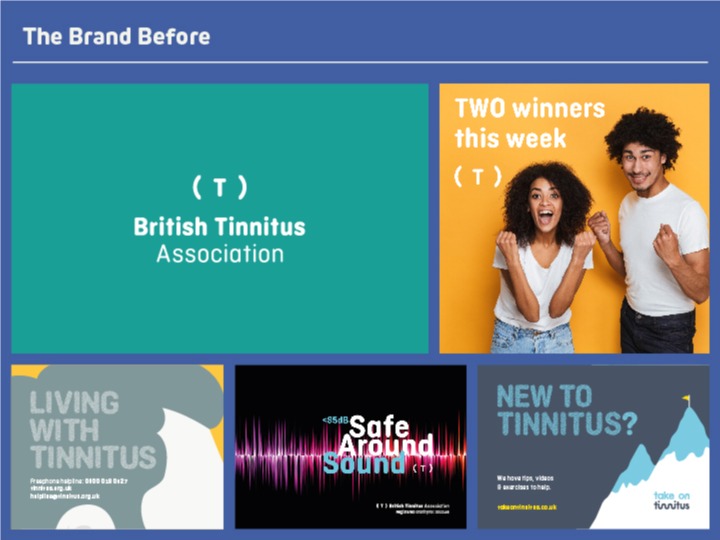
The 'Before'
While The British Tinnitus Association name and identity has a legacy of trust amongst certain audiences, to others the brand was boring and old-fashioned and the visual language uninviting and forgettable. Branding was holding the organisation back and inhibiting its growth.
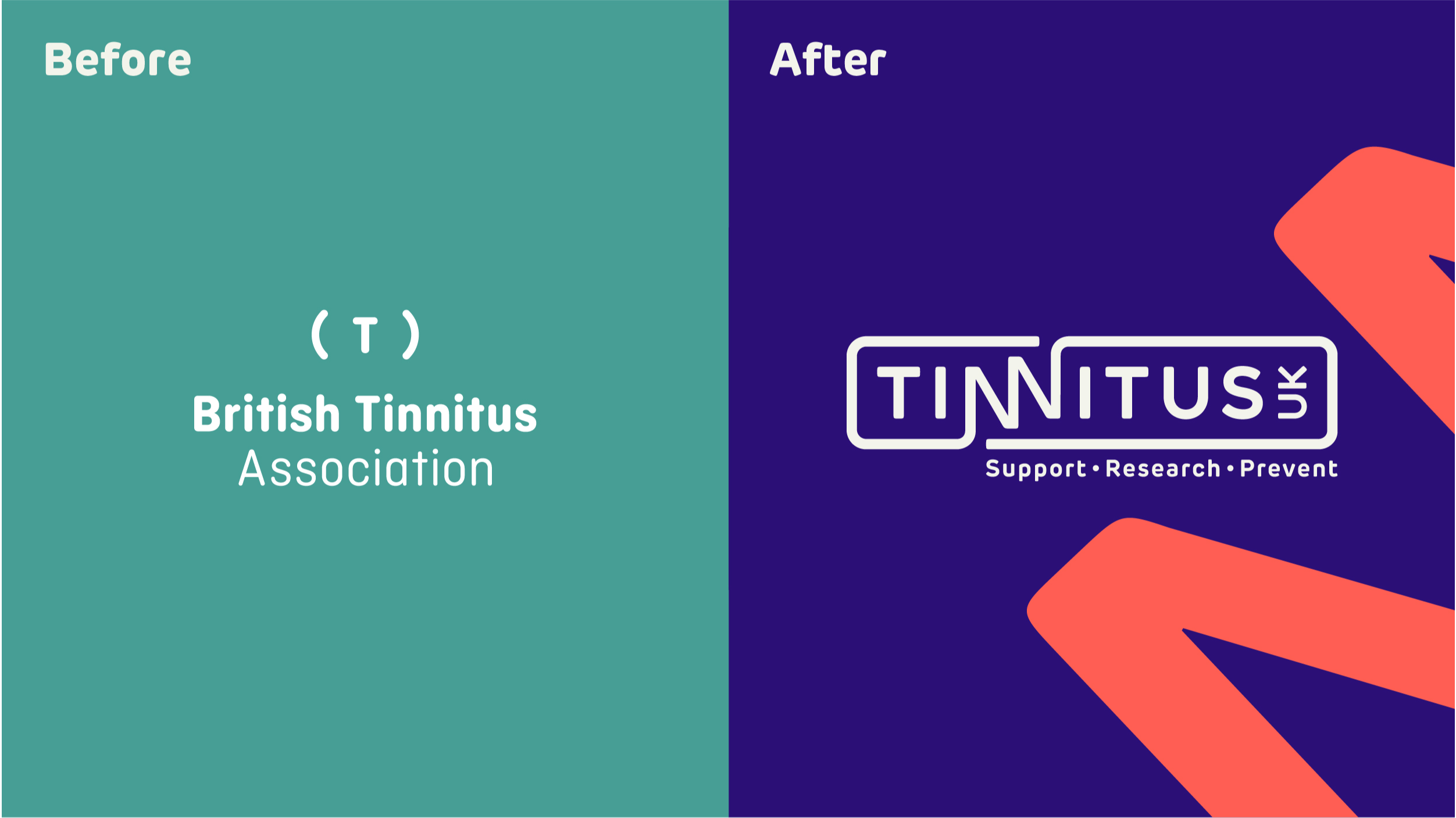
A closer look at the new visual identity
We initially conducted an in-depth nationwide immersion into the condition, to establish the centre of gravity and to enable our solution to unite all operational areas of the charity. This process played a vital role in shaping everything we did.
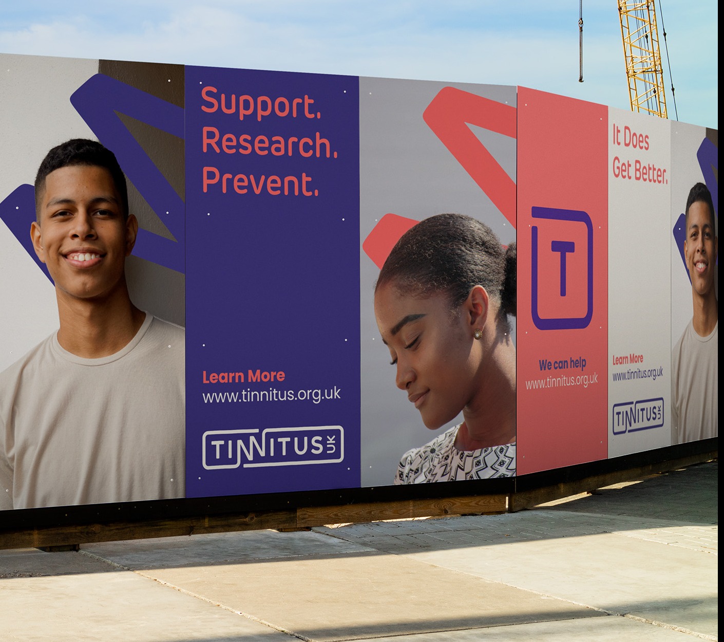
We took a collaborative approach to re-naming the charity; working closely with key stakeholders and following an exhaustive exploration process, we recommended the name and strapline: ‘Tinnitus UK – Research, Support, Prevent’.
Our recommendation was a resounding winner in research and provided us with the springboard for the creative phase of the project.
Inspiration behind the logo design
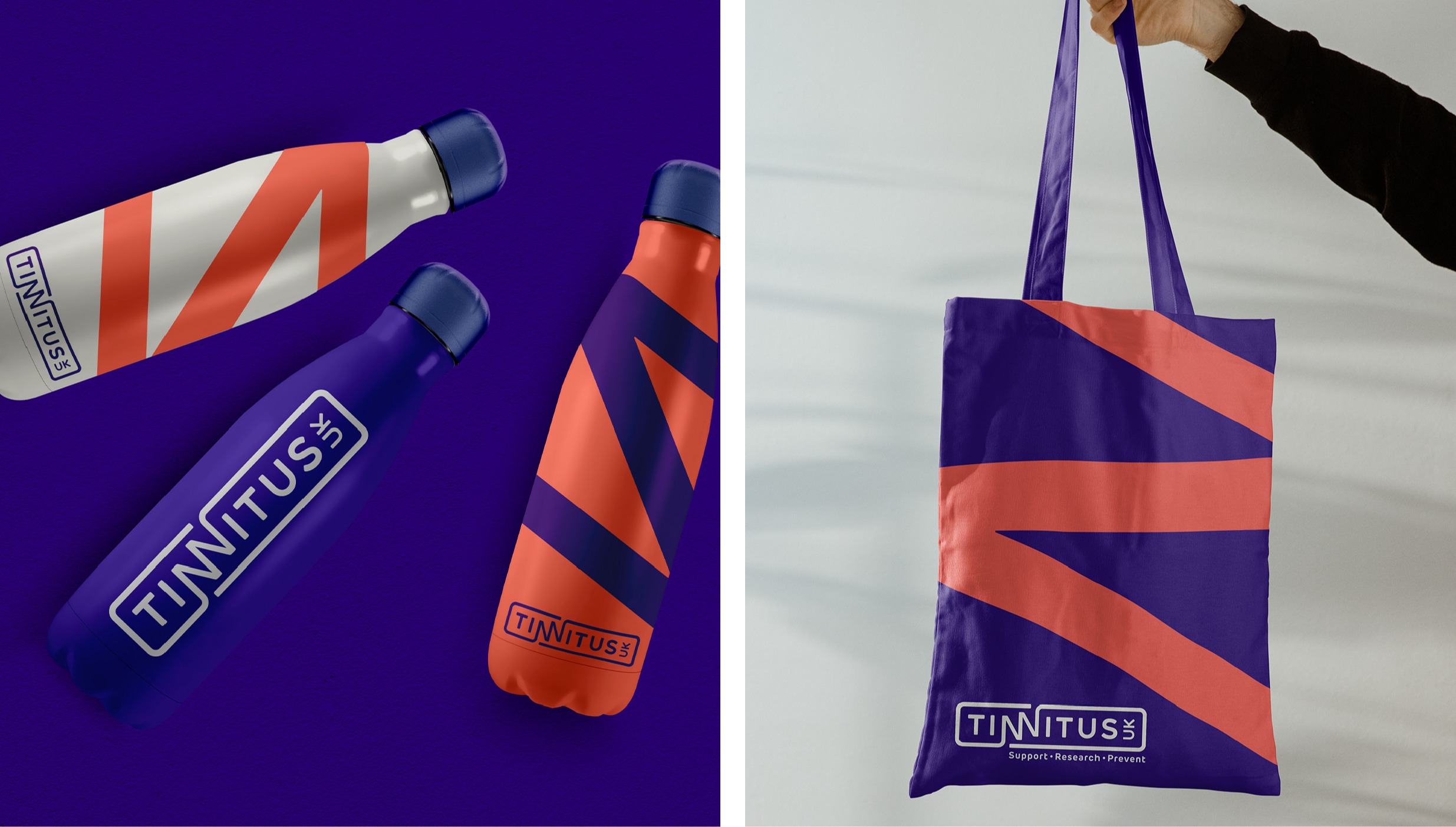
The creative inspiration behind the identity is the double ‘N’ in tinnitus, representing a soundwave that evokes the disruption on sufferers’ daily lives. The ‘NN’ soundwave is a dynamic graphic asset that can be used across touchpoints in different crops, adding pace and interest to the brand’s visual language.
The new Tinnitus UK visual identity is modern and progressive, communicating the approachable, engaging and collaborative personality of the organisation.
A brand refresh
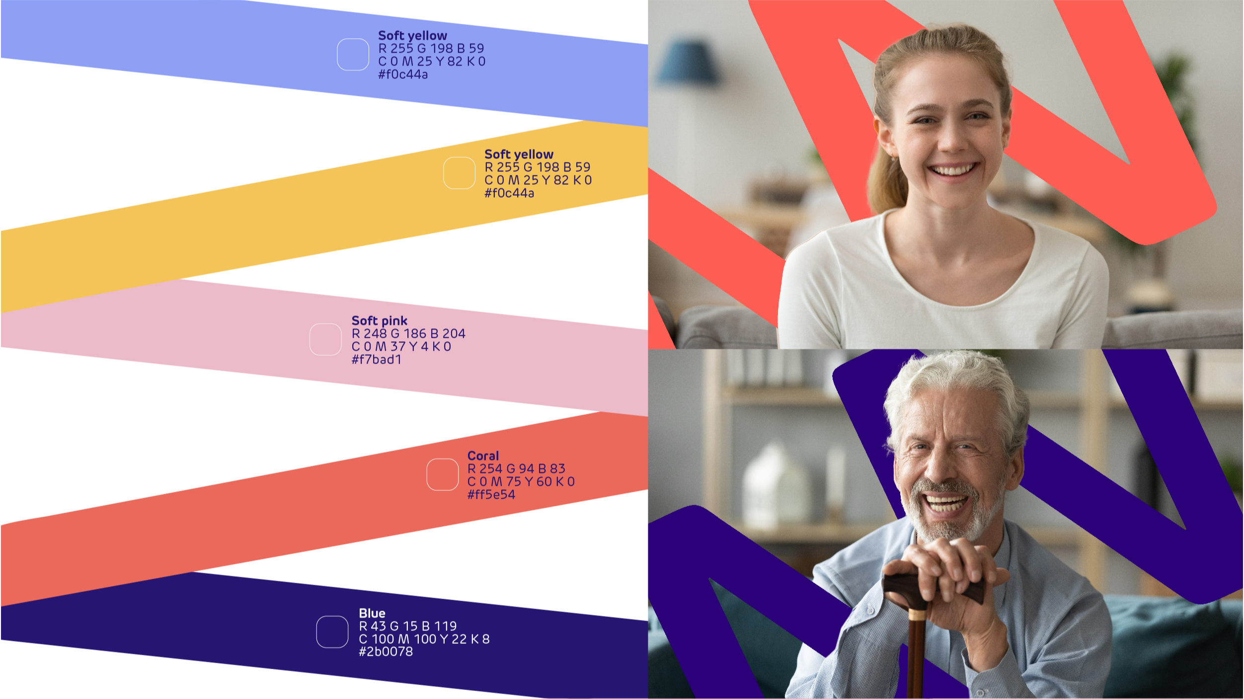
The new colour palette is a fresh take on their previous brand blue, with indigo and a punchy contrast with coral, both anchored together in off-white. We also created a set of accent colours that could be used throughout the identity to add interest. Our colour palette was carefully considered to ensure that it was accessible for those with visual impairments.
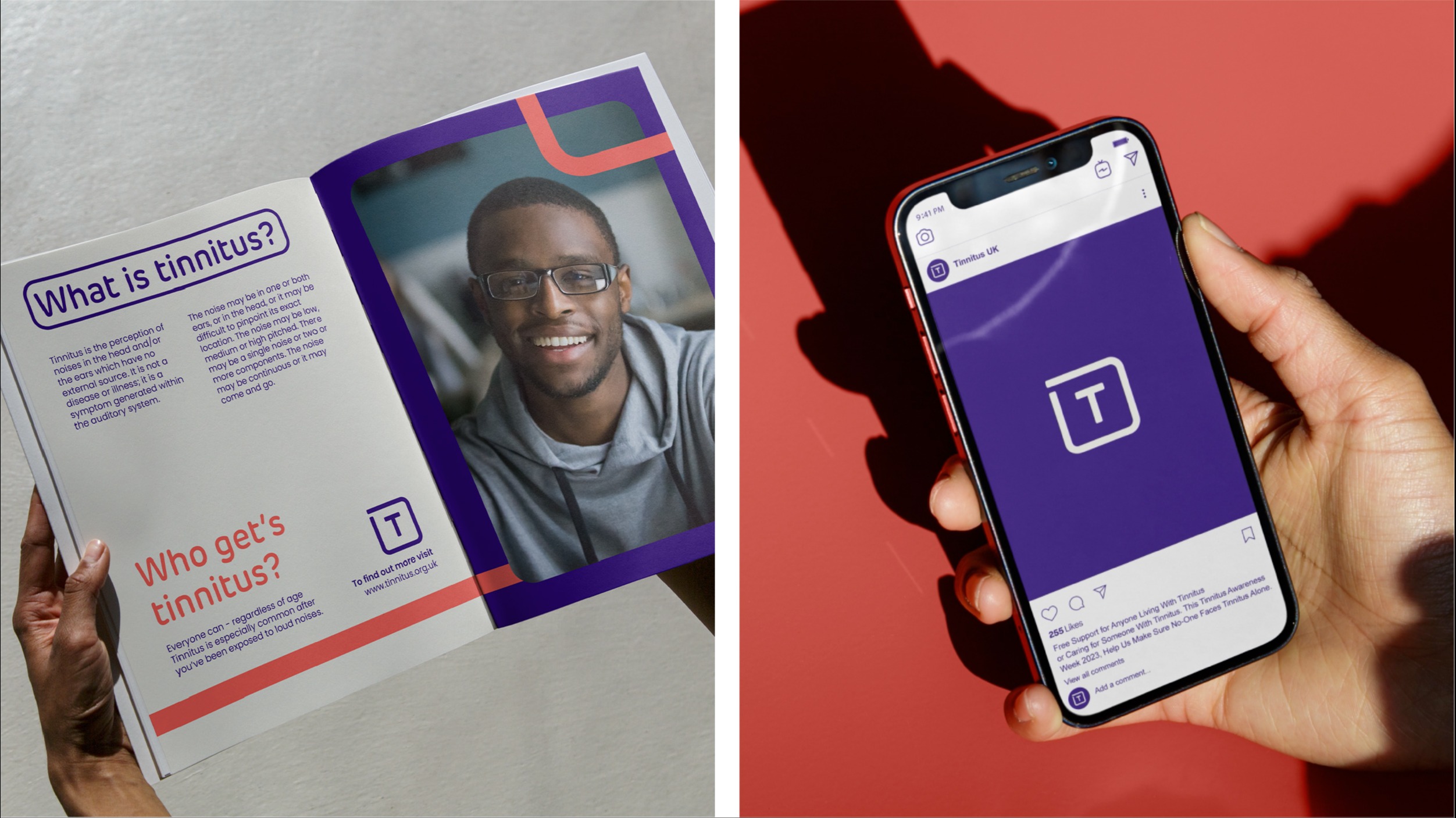
Our photography focused on people to highlight those living with condition, with the style light and bright. Images were available as stock imagery to ensure that the charity’s resources were used as effectively as possible.
We selected a range of great headshots with diverse subjects to be used across communications and introduced the soundwave to interact with subjects; this helped to make the imagery distinctive and ownable.
Bold, distinctive brand world
As a relatively small charity, everything Tinnitus UK does and creates needs to be high-impact, to ensure maximum value and return on investment.
We've created a brand world that's bold, distinctive and really makes Tinnitus UK stand out from the crowd, wherever it shows up.
The final identity
We provided an effective and engaging platform for Tinnitus UK to reach sufferers, promote critical research and communicate their mission to create a world where no-one suffers from tinnitus.
The tangible effect of how the new identity will go on to achieve reach, increase understanding and generate donations is still to come but our client response was a resounding win.
The work we have created with Missouri ushers in a new era for us and will allow us to tap into new audiences and to reach more of the 7.6 million adults in the UK living with tinnitus. In turn, we are hopeful that it will help us reach our vision of creating a world where no one suffers from tinnitus. We are so excited to see where this new chapter takes us and we thank Missouri for their enthusiasm and hard work with us on this stage of our development.
Caroline Savage, Interim CEO
Share
Tinnitus UK: Revitalising a lifeline charity
We were tasked by The British Tinnitus Association with the renewal of their brand identity, creating a new name, tone of voice and visual identity that reflects their expertise and helps them to reach to more people living with tinnitus.
Business Objectives
Disciplines
Sector
Users who viewed this work also looked at: