Hot Pick
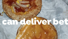
Knorr spotlights fast food fails to deliver better
The campaign from MullenLowe highlights that home made food can be better than takeaways.
The agency has teamed up with a diverse range of makers in London to breathe fresh life into its logo.

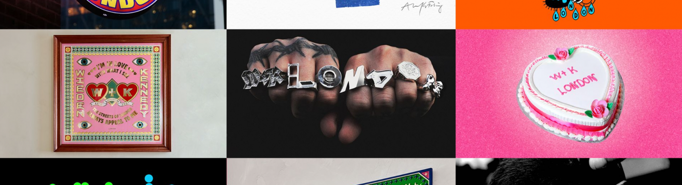
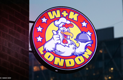
A baker, a barber, a letterpress artist and local school kids were all part of the London makers that have successfully redesigned Wieden+Kennedy London’s logo.
The diverse range of makers were brought together by the agency’s specialist design and branding arm, NOT Wieden+Kennedy, to create their own interpretation of the creative agency’s logo.
The logo project will be continuously refreshed and evolved and the vibrant and eclectic range of logos will be used internally and externally as part of the agency’s branding. All of the pieces created are now in Wieden+Kennedy’s London office, where they are designed to remind the team of the creative eclecticness of London.
The final nine collaborators included Bazanetti, a Hackey-based Jeweller, who created rings which highlighted different aspects of the agency; from the iconic Honda Cog to the Tower Hamlets crest, whilst spelling out ‘W+K London.’
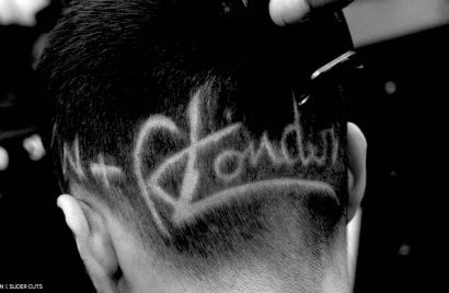
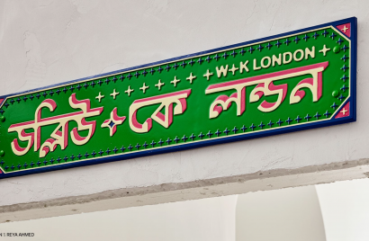
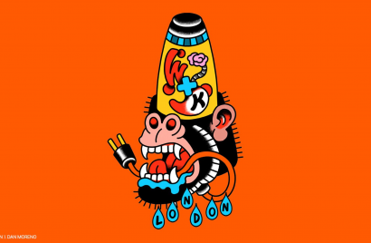
Other contributors include Tattoo Artist Dan Morena, who created three designs, Letterpress Artist Alan Kitching and Designer and Illustrator, Reya Ahmed.
While a class of 10-year olds at St Anne's and Guardian Angels Catholic Primary School in Whitechapel created their own versions of the logo following a half-day session using tools from the agency. Wieden+Kennedy London has partnered with local primary schools for over 10 years as part of its ‘Forever Curious’ initiative to inspire and develop curiosity and creativity in young people.
The brief for the project was to bring to life a cornerstone principle of the agency’s culture ‘Creative Eclecticism’. As the agency explains: ‘By bringing an unexpected range of people and styles together and giving them a voice, great things happen.’
Rather than death by a thousand amends, throughout the process, feedback was kept to a bare minimum to ensure true creative freedom and expression from the artists.
The project is the agency's latest celebration of London’s vibrant creative talent, following a two-year initiative commissioning some of the city’s most promising illustrators to reimagine employee headshots in a variety of eclectic styles, including 3D design, ceramics, watercolour, and more.
Ryan Fisher, President of Wieden+Kennedy London, explains: “The purpose of this creative project is not to invent a grand vision for who we should become, but to distil who we really are. It’s about doubling down on the things that make Wieden+Kennedy London a special place. We're pushing for our culture to be as eclectic and diverse as London’s. Not just because diverse representation is vital, but because great things happen when you bring different people together, and we are deeply proud of the place London occupies in the global creative map. We see this as the first wave of a long-standing, ever-evolving identity that’s constantly being reinterpreted by Londoners.”
Adam Rix, Head of NOT Wieden+Kennedy, added: “Dan Wieden said a Wieden+Kennedy office is one-third the network, one-third the people, and one-third the city – and this is an identity for Wieden+Kennedy London, designed by London. By working with bakers to barbers, school children to chicken shop signwriters, tattoo artists to typesetters – and more, we’ve created an identity full of contradictory styles and approaches, truly reflecting the melting pot of London culture. And like London, this is an identity that will never stand still; it’ll be ever-evolving with new collaborators added over time.”
While the process may have been more chaotic and unpredictable than many agency branding projects, the vibrant results are an uplifting reminder of the creative firepower of the unexpected.
Looks like you need to create a Creativebrief account to perform this action.
Create account Sign inLooks like you need to create a Creativebrief account to perform this action.
Create account Sign in