
Creativity shines a light on domestic abuse
House 337’s new campaign for Women’s Aid underlines the power of storytelling to successfully shine a light on the unseen cost of domestic abuse.
Outdoor ads morphing as we move through a city is a polarising thought. Face recognition and location tagging already make it possible for advertisers to know who and where we are.

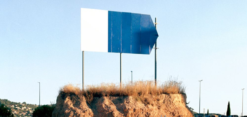
What would our cities look like if it was possible to apply a real-world ad-blocker? Artist Jorge Pérez Higuera showed us this censored world in a series of images titled ‘Public Spaces’. The photo sequence visualises streets, squares, and other city spaces devoid of corporate and branded messages. The result is a rather wonderful feeling of total calm.
Something tells me this is not the future we’re heading for. In Blade Runner 2049 the French Canadian film director Denis Villeneuve envisioned a much more stimulated daily toil, one where the city buildings come alive with personalised greetings. In one iconic scene a holographic model steps out of a giant billboard and right up to Ryan Gosling’s character. And we may not have long to wait as start-up Lightvert is already planning to bring this technology to our streets.
Outdoor ads morphing as we move through a city is a polarising thought. Face recognition and location tagging already make it possible for advertisers to know who and where we are. Whether we’re ready for this level of personalisation is a different story.
In 2017, out of home advertising spend was over £1.1 billion in the UK. This is forecast to increase by 1.5% in 2018. How do we make sure this money is spent on ideas that will improve our experience of public space? The French journalist Robert Guerín said “The amount of air we breathe is a compound of oxygen, nitrogen and ads.” Let’s make sure we’re only putting the good stuff inside our lungs.
Billboards have been decorating cities since the late 1800’s. They’re big, bold and the three most famous sit outside Ebbing Missouri. Last year The New York Times and Droga5 chose this platform to declare the ‘Truth Is Hard’ to New York and the rest of the world. When a sign is this big it shouldn’t be the after-thought in the media plan.
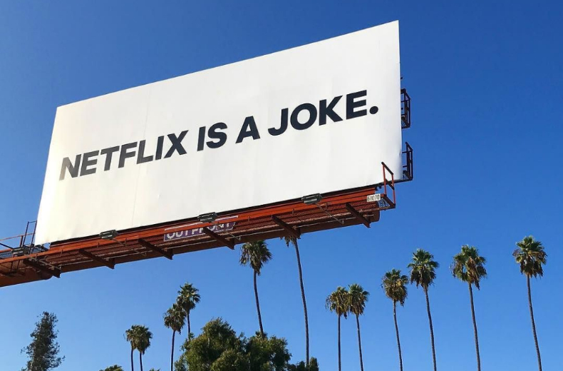
In September last year cryptic ‘Netflix is a joke’ billboards started popping up in New York and LA neighbourhoods, and the media started talking. It transpired Netfix and its agency Battery LA had planted the ambiguous messages to kick start a campaign to launch its new comedy offer. Overnight the same billboards were transformed into ads featuring famous comedic stars.
For UAE Innovation month, The Louvre Abu Dhabi working with TBWA/Raad Dubai created ‘The Highway Gallery,’ a roadside exhibition showcasing 10 of the museum's artworks on a radio-guided tour from Seih Shauaib to Rahba City. Upon approaching the billboards, drivers who were tuned to 100.5 FM, 91.6 FM or 95.8 FM found their music interrupted by a museum audio guide, prompting a new conversation in the car.
The built environment can offer new scope for advertisers. Yes there’s the standard 6 sheet, but there’s also an opportunity to own a unique public space and play with unsuspecting commuters as they pass by.
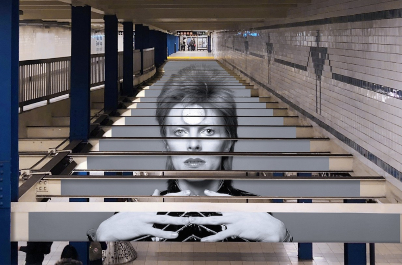
In collaboration with the ‘Bowie Is’ exhibition Spotify transformed a New York Subway station into a large-scale photographic installation and interactive display celebrating the music legend. The centrepiece, created by Italian studio Truly Design, was an image stretched across 30 metal L beams. Each display is accompanied by a code linking to a different Spotify playlist. Spotify also created limited edition Metro cards.
To promote the new MINI Connected Features, which includes real-time traffic information, MINI and Serviceplan Berlin used their out of home ad space to create city shortcuts. Stairs, ladders and secret doors revealed new faster routes through Berlin and illustrated MINI’s features in a fun and interactive way.
To highlight the damaging effect of smoking on the lungs, Cancer Research UK and AMV BBDO London devised an outdoor poster that was also a breath test. A simple message explained ‘the longer you can blow, the more of this message you'll be able to read’. Taking this simple test into a public place helped to get people re-engaged with a lifesaving message.
If you’re going to shout about it, and many outdoor ads do often feel like they’re shouting, then you may as well do it with purpose.
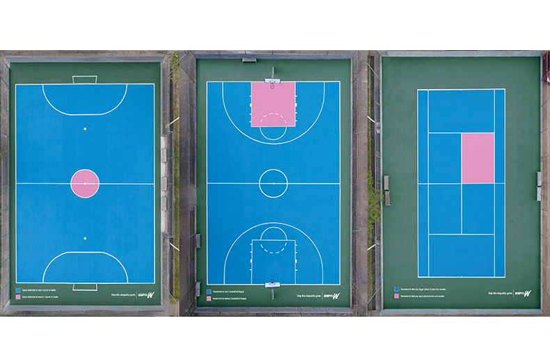
There is a latent inequality between female and male athletes, a reality which prompted ESPNW and Africa, São Paulo to bring this debate to media attention in a very visible way. From tennis to basketball, sports courts were transformed into gender inequality infographics. The idea was executed electronically during ESPN’s broadcasting of women’s sports while, the project simultaneously took place in real courts, parks, gymnasiums, and clubs.
Yahoo! Japan, didn’t want the busy people of Tokyo to forget the impact of the 2011 Japanese earthquake and tsunami. To highlight how high the devastating wave reached, Hakuhodo Kettle, Tokyo created an huge outdoor poster on the Sony building that marked 16.7 meters.
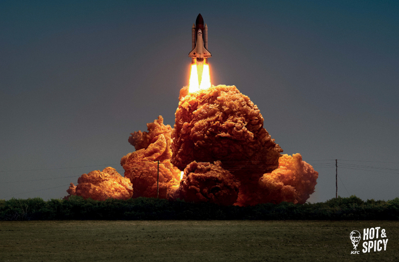
If your message is not purposeful, then it should definitely be beautiful. Like magpies we are drawn to the latest shiny technology object, but the real soul of advertising still lies in great art direction and craft.
KFC and Ogilvy Hong Kong has executed the latest campaign for its signature Hot & Spicy recipe with cinematic style. In three key images balls of fire are exchanged for fried chicken, capturing the explosive power of the famous KFC recipe. There’s a rocket launch, dragster car and super hero scene that wouldn’t look out of place in a Marvel film. The final images are the perfect alignment of concept and craft.
Ice cream advertising is not well-known for its sophistication. So, when Magnum’s new outdoor campaign hit the streets of London, the illustrations decorated commuter journeys with unexpected style. Created by LOLA MullenLowe in Madrid with artworks by illustrator Thomas Danthony, the billboards and murals added a touch of class to standard street signs.
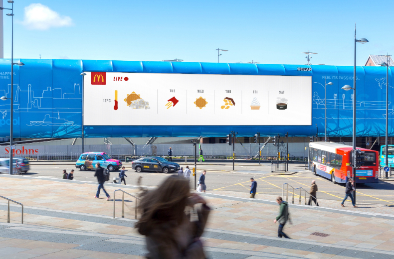
Ever since British Airways worked with OgilvyOne Worldwide to create a world-first digital billboard that reacted to specific BA planes as they flew overhead, advertisers have been thinking up new and creative ways to respond to real-time data.
Brits love to talk about the weather. In April McDonald’s joined this conversation by using real-time MET Office data in its digital outdoor campaign. Leo Burnett London turned the McDonald’s menu into weather icons. An unwrapped burger represented the sun while an upturned box of fries signified rain.
In Canada, digital billboards along highways in Toronto and Montreal tailored messages to suit how fast people were moving. The food giant Danone was the first to try the new technology to advertise DanActive drinkable yogurt. Created with Y&R Montreal, the ads displayed four messages based on congestion levels, from ‘Moving right along’ to ‘I’m never getting there!’
Air pollution is London is felt, but not often seen. This prompted Tiger Beer and Marcel Sydney to team up with Anriudh Sharma, the inventor of Air-Ink, which turns air pollution into ink. The beer brand installed a billboard on Shaftesbury Avenue featuring artwork made using Sharma's tech and polluted London air. To accompany the outdoor campaign, Tiger opened the Clean Air Gallery in Brixton.
Looks like you need to create a Creativebrief account to perform this action.
Create account Sign inLooks like you need to create a Creativebrief account to perform this action.
Create account Sign in