Kearney: Expertise with empathy
A brand refresh that highlights the authentic core of consulting—people.
Challenge
A.T. Kearney is one of the world’s largest management consulting firms with more than 3,600 people across 40 countries. Its clients include more than three-quarters of the Fortune Global 500 and influential governments and non-profit organizations. But its brand wasn’t getting the recognition it deserved. When speaking to clients, it was clear they appreciated the firm, the people and their outstanding work, but they couldn’t identify a “signature” of the brand. It was challenging to identify a single, simple story about who Kearney is and why clients should care.

Insight
We conducted primary research, including qualitative interviews with clients, employees, firm Partners (also owners) and a quantitative survey of global C-suite executives. Paired with a deep dive into industry trends, market analysis and global business objectives, we uncovered a disconnect between the firm’s ambitions and its brand strategy.
The first step was to define a simple strategic brand platform with a focused positioning and set of principles to establish a unique idea, voice and experience. This led us to center the new branding around employees. Its people are real, relatable and refreshing—a truly original combination in the world of management consulting, which can otherwise be seen as elitist and arrogant.
Answer
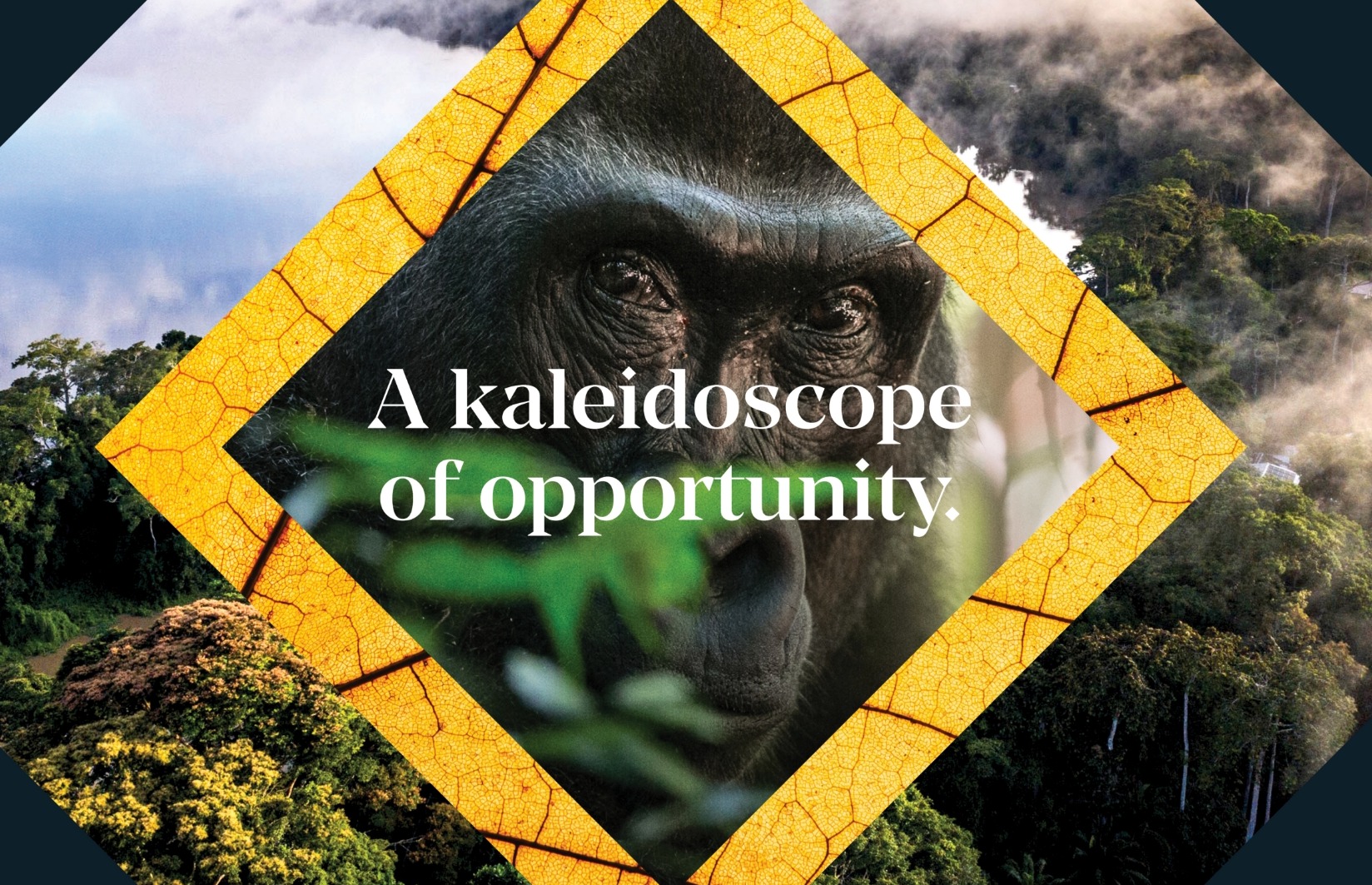
The brand strategy led to an elegantly fresh visual identity update. With an accent of purple, a timeless black and white system serves to highlight a new compelling approach to photography. With our encouragement, the firm chose to eliminate all stock images, replacing them with original photos taken by their people, bringing employees further into the brand spotlight.
We extended the strategy, voice and design into compelling assets for a global launch in January 2020. A brand launch film featured Kearney employees in scenes that depict the raw, emotional moments we all experience at work. Website, social media presence, office design, events, and internal communications have been refreshed to tell Kearney’s story simply and powerfully.
Inclusive and open, a shortened name expands beyond one individual to include the entire global family. Understated and confident, the logo is rooted in a century of experience without overshadowing the bold and future-forward ideas of the brand’s consultants today.

A refreshing and relatable tone of voice brings humanity to the Kearney messaging. In a world of overused jargon, the brand sparks a conversation and doesn’t let language get in the way of the expert advice and deep understanding of how to implement progress for its clients. It reflects the way communication is changing and an empathic approach to every relationship and interaction.

Our people have always been and will always be our brand, this new look and feel simply focuses on them.
Abby Klanecky, Chief Marketing Officer

Share
Kearney: Expertise with empathy
A brand refresh that highlights the authentic core of consulting—people.
Business Objectives
Disciplines
Sector
Users who viewed this work also looked at:
