
Trend
Boots captures the joy of saving
The Savvy Savers campaign features Boots shoppers celebrating the savings they’ve made.
Coley Porter Bell refreshes the brand’s iconic image with its redesign

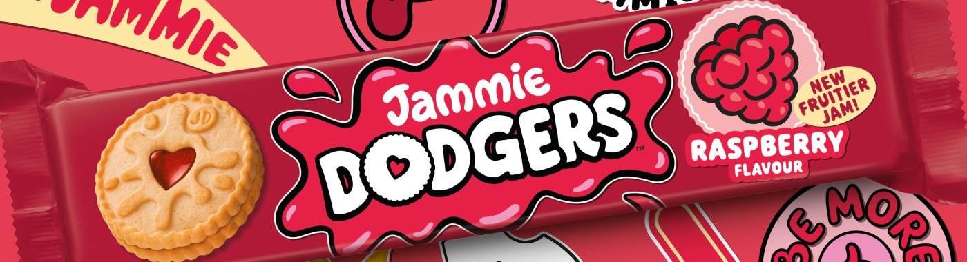
Classic British biscuit brand, Jammie Dodgers, has created new and updated packaging to reflect the tastes of a modern audience, and drive awareness for the brand.
The redesign was spearheaded by global branding and design agency, Coley Porter Bell. It factors in the cheeky, good-natured attitude Jammie Dodgers is known for, whilst refreshing its image.
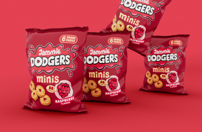
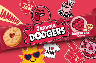
Retaining the iconic colouring, the new packaging for the full size biscuits and the minis now features a hero font of softer edges and a brand new fruit graphic. The sticker-like raspberry promotes the biscuit’s ‘fruitier jam’, and is intended to mirror children’s stickers.
Coley Porter Bell worked to weave a creative strategy of ‘Cheeky at Heart’ into the redesign of the brand’s portfolio. The sticker aspect not only reflects children’s interests, but also cheekily acknowledges the sticky nature of the jammy treat.
Whilst in-keeping with the iconic branding audiences have grown familiar with, the new packaging is a quietly evolved rendition, updated to match currently popular aesthetics. It still has the Jammie Dodgers logo, the jam splat, and the love heart synonymous with the biscuit brand.
The new packaging is intended to bring consumer awareness to the full scope of product offering and ensure consistency across the brand’s portfolio. It launched in the UK earlier this month (July).
With its updated image, Jammie Dodgers continues to stay relevant to the market whilst leaning into the branding that it is well-known for. The redesign incorporates both old and new, preventing the biscuit from fading into shelves.
Looks like you need to create a Creativebrief account to perform this action.
Create account Sign inLooks like you need to create a Creativebrief account to perform this action.
Create account Sign in